Portfolio (Scribd.com)
Project Corrections / Time spent: I spent a full two hours correcting various past projects. The corrections and reasons why I made these corrections are as follows:
-Flier (Time spent: 25 minutes):
I changed the title to create more contrast (changed “Graduate” to white font and placed it in the black bar at the top) and to make it stand out more (changed “Leadership Conference” to a larger font).
I aligned all the elements on the left side of the flier and aligned the bottom of the body text to the bottom of the date, time and place on the left.
I also made the repeating bars go up at a consistent rate of .5 in (including the picture), to create repetition and flow.
-Montage (Time Spent: 20 minutes):
I completely redid the photo of Christ. I reselected him and blended him into the picture of the child praying again. This time I tried to make the blending more seamless than before. I also made him larger than before.
-Web Page (Time Spent: 20 minutes):
I added more space after each list item so that the sentence wouldn’t run into the list item. I did this in the CSS document.
I made “My logo design process” the same lime color to bring out my color scheme more than just my link being the lime color.
I got rid of some of the extra white space in the web page, especially around the logo and between the logo and the first paragraph.
-Event Ad (Time Spent: 15 minutes):
I made the text in the image (in the empty area of the trunk) bold. I did this to try to make it stand out more. I also increase the spacing between letters to create more legibility.
Because I increased the area the text took up, I had to realign the orange bars to the new text space to the right. I did this to create more alignment. I really tried to have everything align with something.
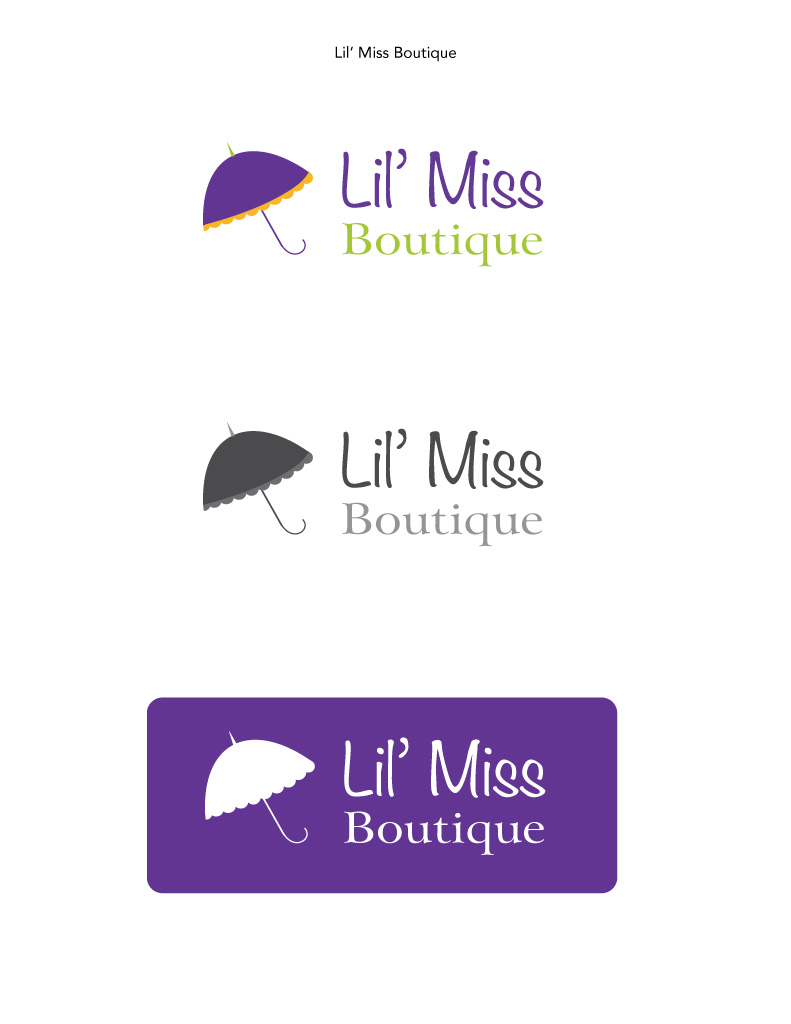
-Logo (Time Spent: 15 minutes):
I thought of ways to get the handle of the umbrella thicker so people would be able to see it when the whole logo would be sized down. I ended up putting a stroke of the color of my choice on the handle. I then expanded it with the stroke.
-Brochure (Time Spent: 30 minutes):
I read through my entire brochure looking for grammar and spelling mistakes.
I also changed a bit of the placement of the objects that were a little off. I did this just a little bit.
I then retook screenshots of the brochure to add to my portfolio.
Message: I want to showcase my completed works in a professional way. I also wanted to show my creative and structured personality.
Audience: Potential clients and employers.
Top Thing Learned: Have patience when working with these programs (especially scribd.com).
Future application of Visual Media: I will continually try to learn more about these programs and designing skills in order to be prepared if someone were to hire me to do something along the lines of what we did in this class.
Color scheme and color names: Monochromatic (Green)
Title Font Name & Category: Night Still Comes (Oldstyle)
Copy Font Name & Category: Champagne and Limousines (Sans Serif)
Thumbnails of Images used:


Sources (Links to images on original websites / with title of site):
Bridge: https://unsplash.com/photos/eOpewngf68w
Grunge Texture: http://lostandtaken.com/blog/2015/5/15/10-simply-subtle-grunge-textures.html
Wood Background: http://www.digitalcameraworld.com/2012/05/09/100-free-photoshop-textures-to-download-now/


